So, people have been complaining that the briefs are too "strict", or don't give us enough freedom...but this brief, made me go crazy lol.
And for that reason...Im not that happy with my 100 photos.
And the photo size 3 x 2.5...? That ruined mine aswell, lol. I sent them off to get printed, I put 2 images on one 7 x 5 page, and they look...pants. The quality is pretty poor but I know for a fact they wouldn't have been any better if I had printed them off on my printer plus I would have had to buy more ink. It also took away the effect of some of the images in my opinion...I wish I would have just gone for 6 x 4.
ANYWAY! I will stop blaiming the brief haha. Im just a bit worried mine won't be what we were supposed to do...as usual.
I chose landscape orientation and I took about 500 photos...and printed about 104 or something, I wish I knew what we were doing with them...
Night. x
Sunday, 30 November 2008
Obvious.
Well. First off let me say,
I hate how weather or stress or people sneezing around you can make you ill...because I developed a cold last weekend and it was just...a bad cold on tuesday. But on wednesday :o I actually couldn't be bothered to move lol, because I knew I didn't Have to, I had no motivation at all.
Therefore...I missed the bloody martin parr talk :|
The one photographer who I have been researching since I was at high school.
And now I have a cough that sounds like a cross between a barking dog and someone whose been smoking about 30 a day for the past 30 years.
Anyway! :D Moan over...

 2 Images off google...how crap am I? But I like them!
I love Parr's style of documetary photography; the colour and simplicity make them interesting to look at and they do actually document something.
His collection "Think of England" is so funny and true. More to the extent of how people "percieve" england...Tea, seaside, socks and sandals etc lol.
If I had one direct brief like 'produce images that sum up how people percieve england' I would hope that I would approach it in a similar way to Parr.
Woo.x
Britains missing top model...
This is where I first saw the next photographer.
Rankin :)
Well, John Rankin to be precise.
Now, I don't really take many portrait pictures but this is only because I don't like asking people if I can take pictures of them, I prefer them to Want me to take a picture of them...if that makes any sense at all. However, when it comes to inspirations or influences, I like a Lot of photographers that concentrate on portraits or at least pictures with people in them.


 These pictures are just amazing. There is nothing else I can say about it...well there is, but thats the most important thing lol.
The clarity of these pictures and the honesty and reality that they portray is amazing.
Obviously these are just 3 pictures from a huge portfolio of work, and they're from his most recent collection I think...but they stand out to me :)
I really like the 'crispness' of the images and the contrast, it just makes them so eye catching and makes you want to look at them. Interesting!
Although Im contradicting what I just said in my previous post about the style of photography documenting something better than posed pictures, I think these shots...although they are posed...they are a lovely documentary images :)
x
At first I wish I hadn't looked at this...
Sooo...even though we handed in our module last week and were having a little rest...
It couldn't last for too long of course! Lol.
Seen as we got the next brief before we even handed it all in haha.
Im not gonna lie, I didn't look at the "Useful photographers" first, which was probably a stupid idea, because then I would have had a better idea of what to do :) Foolish.
Anywhoooo, I have looked at them for secondary research.
First off...Nan Goldin.
This is what I wish I hadn't looked at, at first! Because I simply typed it in to google and it came up with what looked like a child looking up another child's skirt or something? Lol.
But, after I got over that, I looked more and she's actually the kind of documentary photographer I like because for documentary photography, it doesn't look very posed!
She kind of reminds of Richard Billingham?

High class family, clearly.
 The two pictures above are Billingham...
And the 3 below are Nan Goldin.

 "Joana with Cigarette at the Chateauneuf de Gadagne, Avignon"
 This one is called "Joan Crawford on fire; Thanksgiving in NJ"
I even love the titles of her work lol, so obvious but...especially the Joan Crawford one, Funny.
Both of the artists seem to take their pictures with a simple 35mm film camera, I think this, because of the quality of the images.
All the images are so simple and look somewhat "candid"; I think they 'tell a story' or 'document a moment in time' better than a posed image.
I have liked the work of Billingham for quite a long time but now I would like to do more research into Goldin.
Ahh :) Good times.x
Monday, 24 November 2008
I forgot to post this...
My final mail shot :)

I have some better pictures of the final resolution, from the crits but I forgot my camera so I'll put them up when I get home.
And final typeface...

Not overly pleased with this, but I think it works quite well.
See y'all.x
Well...Today is the day :)
When it will all be gone...
Module 1 - Deadline.
The only thing Im sad to see go is the last brief, my mail shots lol.
Looking back on the work we've done, when I was putting it in order, it surprised me how I developed in such a short space of time.
Mainly, becoming more involved with the briefs.
So...I enjoyed this module but, I sure am not gonna be sad when I hand it all in lol.
Thankyou :)
x
Sunday, 16 November 2008
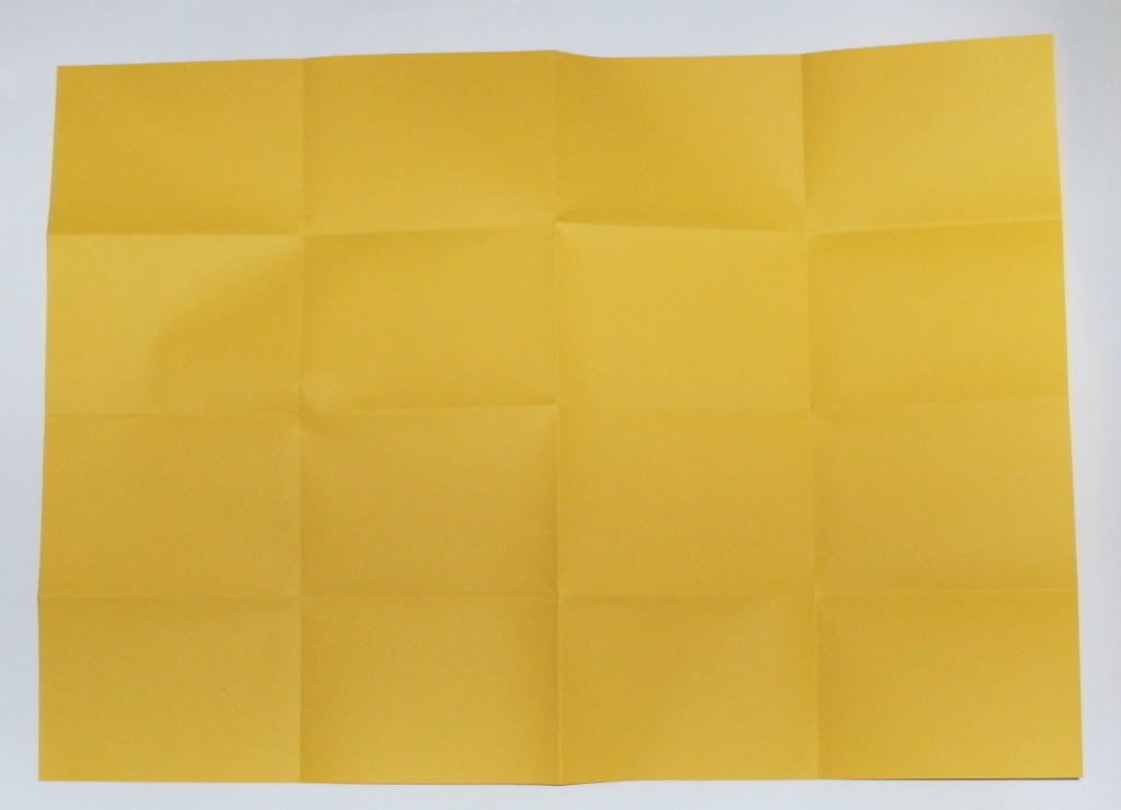
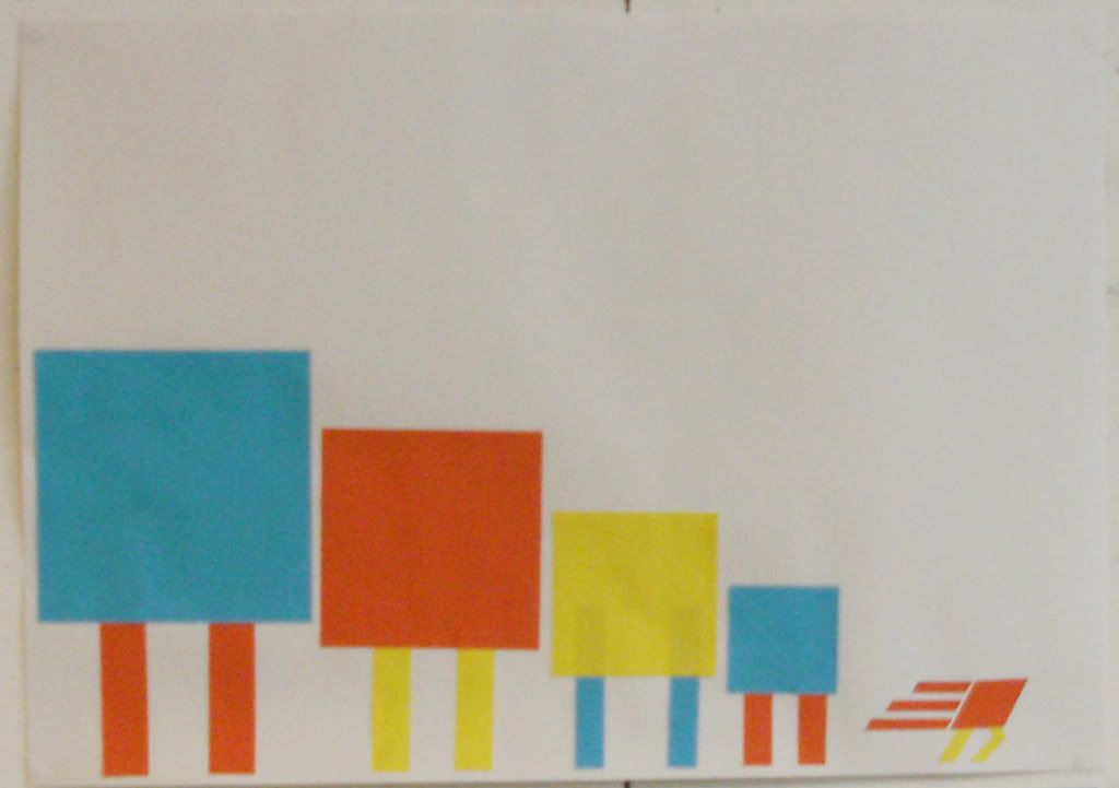
Oooo, shapes :D
Well.... I said I would take my shape alphabet into illustrator and so i did :)
I love it lol.
I love it lol.

And then I added colour...mmmm. Except I think it might possibly look better without it?
 Thats all. Thankyou please :)
x
Finally for today...
My beautiful envelope.
I got ridiculously excited by the idea of making my own envelope, so I got on with it :D
I have done other work i.e. my mailing list and message ideas. But I'll state that afterwards...


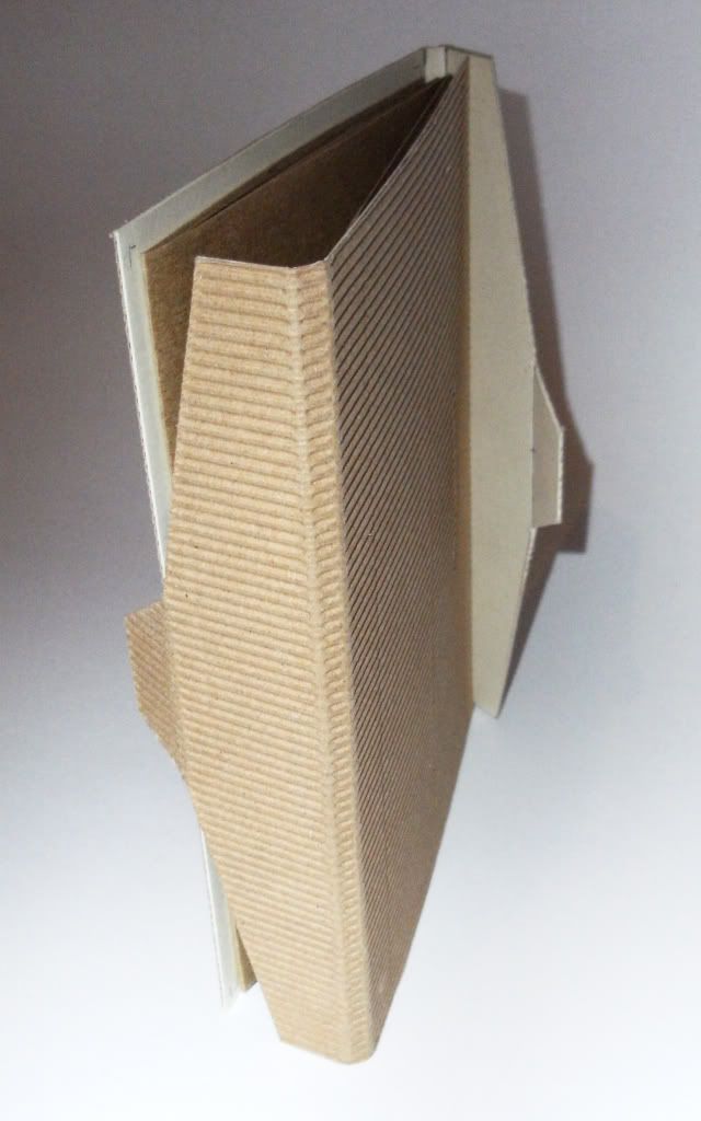
Yes! It opens from both sides! :o
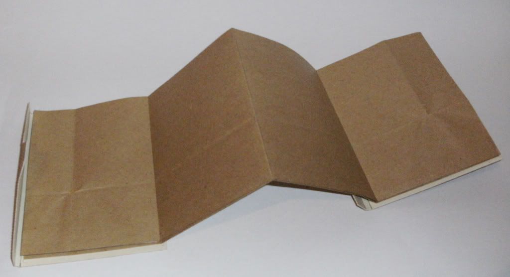

NOW! I don't know about the brown paper fold out...is it too predictable?
Or does it relate too much to recycling?!...which in a way I suppose could could because of recycled words? :s
But...what about red or yellow?!
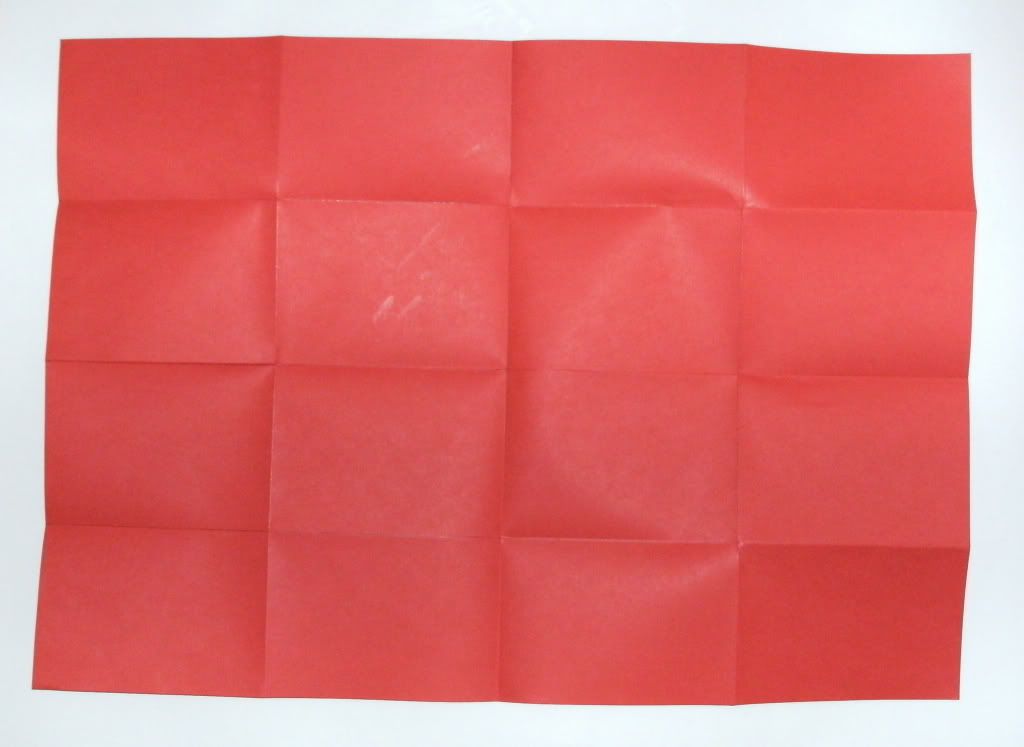
I think yellow would be quite eye catching?!
Mmmm :)
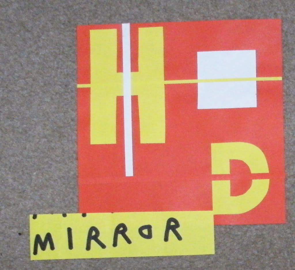
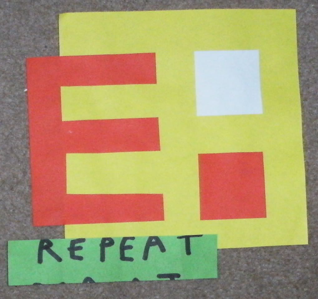
So, my message is "Everything has been said before"...Say it differently.
I intend for the fold out poster to be double sided, and very simple.
So one side will say "Been there, Said that"
And the other will have the quote "Everything has been said before..." Andre Gide, Literature Nobel prize winner 1947.
I also think I want to have "Say it differently" or something along those lines on the envelope, on the opposite side to the stamp and address.
My mailing list is going to be tabloid newspapers, politicians and publishers...as these are all saying things that we kind of know but they have the oppurtunity to say it differently.
I.e. Tabloid newspapers all have near enough the same stories in them, but how they say it can depend on the audience, like broadsheet papers can publish the same stories but because of how they say it...the audience is completely different.
If that makes sense lol.
It will all come together in the end! :)
x
I got ridiculously excited by the idea of making my own envelope, so I got on with it :D
I have done other work i.e. my mailing list and message ideas. But I'll state that afterwards...


Yes! It opens from both sides! :o


NOW! I don't know about the brown paper fold out...is it too predictable?
Or does it relate too much to recycling?!...which in a way I suppose could could because of recycled words? :s
But...what about red or yellow?!

I think yellow would be quite eye catching?!

Mmmm :)
So, my message is "Everything has been said before"...Say it differently.
I intend for the fold out poster to be double sided, and very simple.
So one side will say "Been there, Said that"
And the other will have the quote "Everything has been said before..." Andre Gide, Literature Nobel prize winner 1947.
I also think I want to have "Say it differently" or something along those lines on the envelope, on the opposite side to the stamp and address.
My mailing list is going to be tabloid newspapers, politicians and publishers...as these are all saying things that we kind of know but they have the oppurtunity to say it differently.
I.e. Tabloid newspapers all have near enough the same stories in them, but how they say it can depend on the audience, like broadsheet papers can publish the same stories but because of how they say it...the audience is completely different.
If that makes sense lol.
It will all come together in the end! :)
x
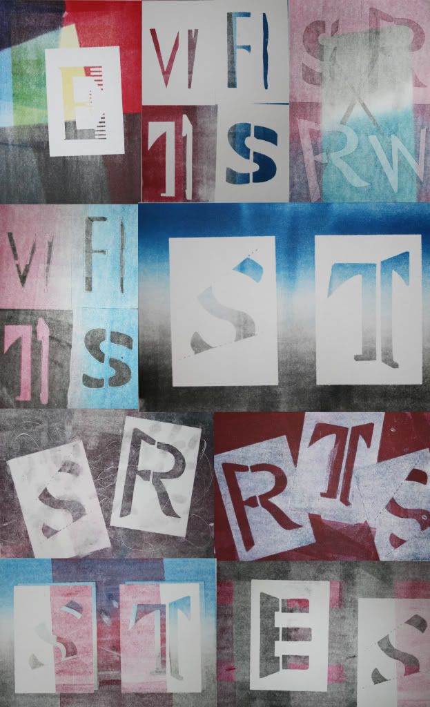
Visual language...obviously the best 3 hours of the week...lol.
I've already posted about visual language, and the fact I do find it quite interesting!
Its also really helping in terms of communicating your message to your audience, good stuff.
Sooo...here's what I produced in the first week. With my lovely words from the Randomiser :| lol.

I had to scan two of them because you couldn't really see what they them.
And here is what produced in the second week...

 Snake
Snake
 Dog
Dog

I did have strong jumping aswell...but I can't find my photo of it, lol.
Pretty Crazy! :)
x
Its also really helping in terms of communicating your message to your audience, good stuff.
Sooo...here's what I produced in the first week. With my lovely words from the Randomiser :| lol.


I had to scan two of them because you couldn't really see what they them.
And here is what produced in the second week...


 Snake
Snake
 Dog
Dog
I did have strong jumping aswell...but I can't find my photo of it, lol.
Pretty Crazy! :)
x
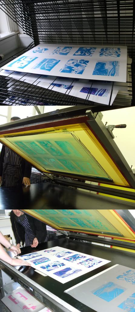
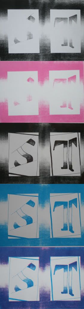
Print...
I didn't really enjoy mono-printing. But even Roger said "He learnt it once in his degree and then never used it again" lol.
But, it was interesting to learn it!...even though I did it last year, but shhh.
Even though I didn't really like it...I think my final prints are quite nice.
HOWEVER.......moving on from mono-printing. We have screen printing :D Oh yes. I only did this once last year, on my final project just for experimenting so i never really focused on it, but this workshop was great. Even though it takes quite a while to prepare you screen for printing, once you've done that. You can churn off loads in a small amount of time!
Needless to say, i enjoyed it :) and want to go there with this mail shot brief.
XD
x
But, it was interesting to learn it!...even though I did it last year, but shhh.

Even though I didn't really like it...I think my final prints are quite nice.
HOWEVER.......moving on from mono-printing. We have screen printing :D Oh yes. I only did this once last year, on my final project just for experimenting so i never really focused on it, but this workshop was great. Even though it takes quite a while to prepare you screen for printing, once you've done that. You can churn off loads in a small amount of time!
Needless to say, i enjoyed it :) and want to go there with this mail shot brief.


XD
x
MMM, blue.
So, i've already posted my ideas on the 'what is blue...' brief.
This is the work I produced for it.
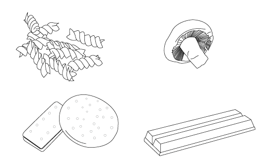
First I looked at illustration :
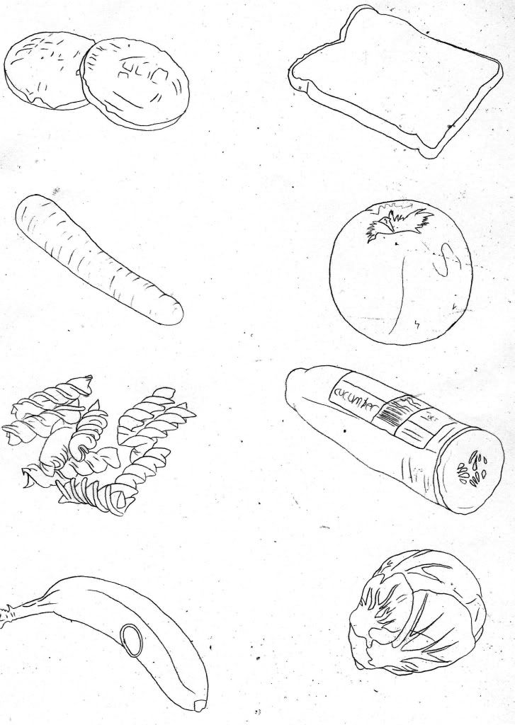
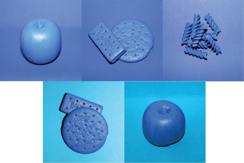
I took photographs of different types of food, and then traced them.
Following this, I took them into illustrator, which I think it works quite well!
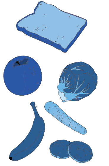

And then I developed it on to look at how I could use photography in it...So I painted food blue :D
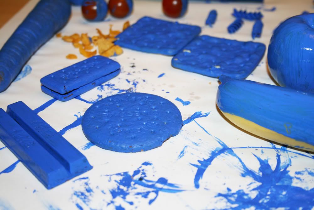
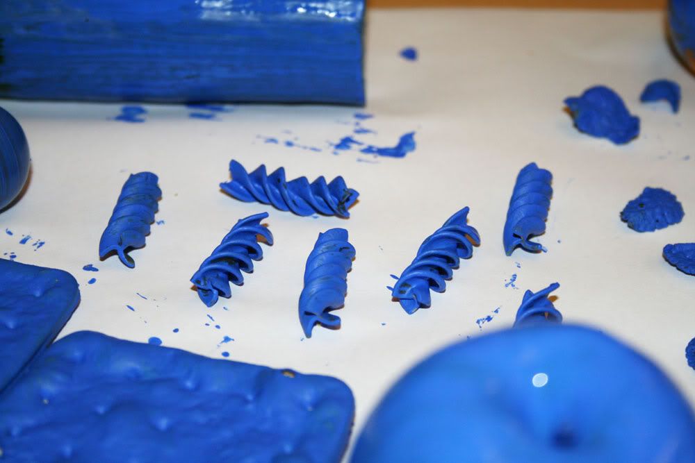
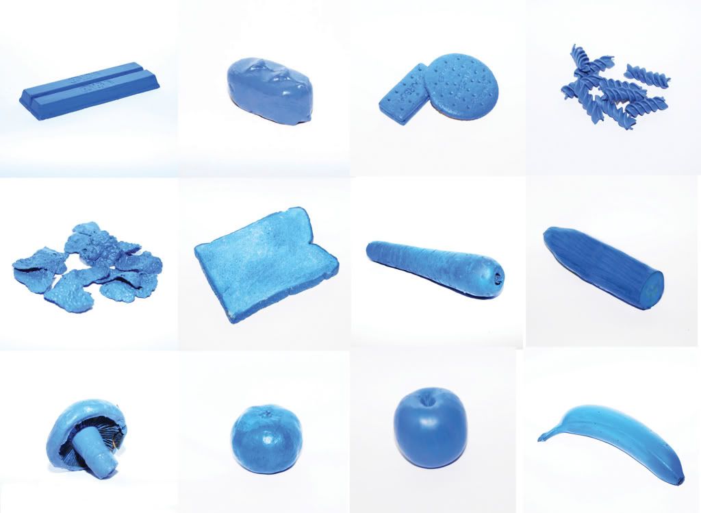
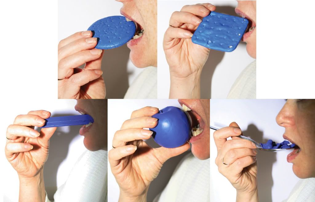

I actually really liked my final set, although the quality of the images was BAD, printed out in the computer rooms. But from far away it looks ok lol.
The only criticism I really got was that the message wasn't really.
This seems to be a continuous problem for a lot of people during this module, the fact that they understand their own message but it doesn't communicate to the audience very clearly.
Maybe I could have overcome this Really easily by just adding type to my work.
:o x
This is the work I produced for it.
First I looked at illustration :

I took photographs of different types of food, and then traced them.
Following this, I took them into illustrator, which I think it works quite well!


And then I developed it on to look at how I could use photography in it...So I painted food blue :D


I actually really liked my final set, although the quality of the images was BAD, printed out in the computer rooms. But from far away it looks ok lol.
The only criticism I really got was that the message wasn't really.
This seems to be a continuous problem for a lot of people during this module, the fact that they understand their own message but it doesn't communicate to the audience very clearly.
Maybe I could have overcome this Really easily by just adding type to my work.
:o x
I see your truuuuue colours...shining through.
Now this, Im not gonna lie. I really didn't understand :s
I get the concept, that the environment that a colour is viewed in can change what the tone of the colour looks like...even though it doesn't Really, but it looks like it.
BUT...I wouldn't choose to use any of these pictures in my work.
It was...kind of interesting.
But then again, i suppose I lost interest half way through when my battery ran out on my camera lol.
ANYWHO!
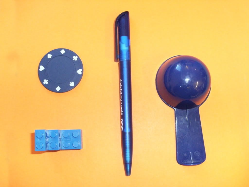
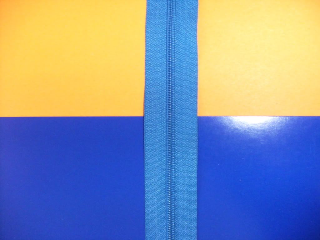
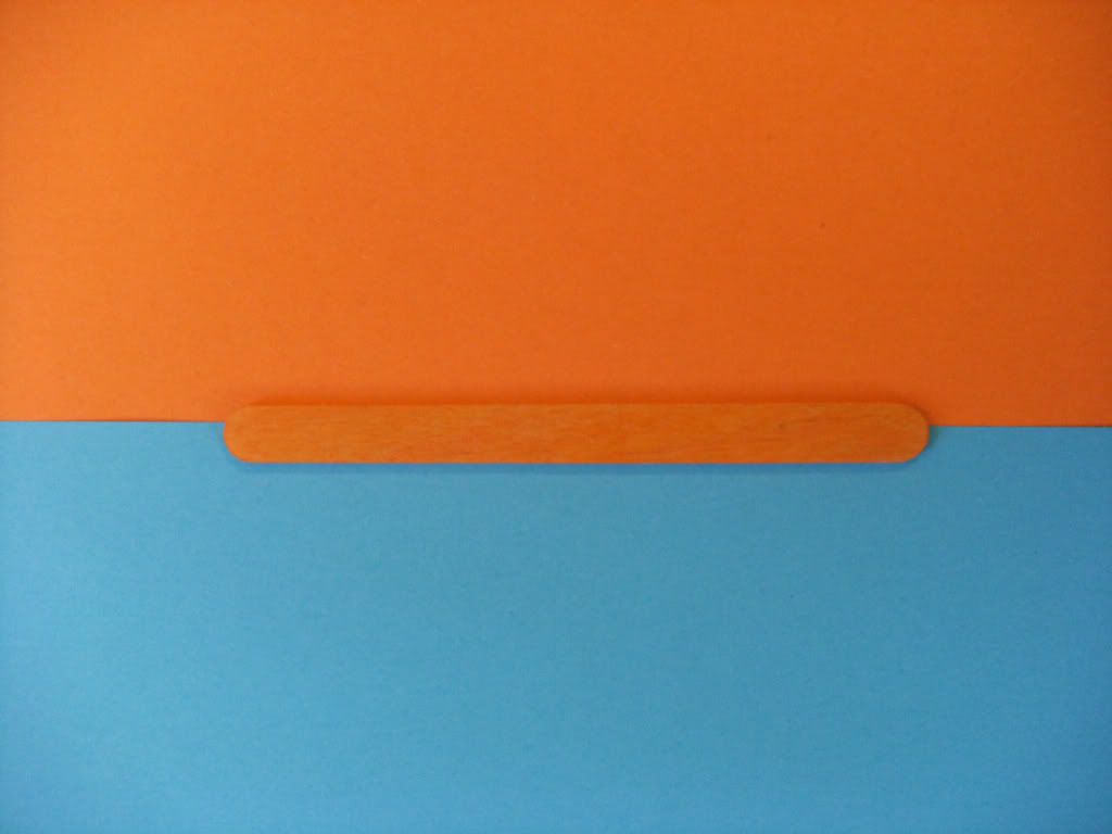
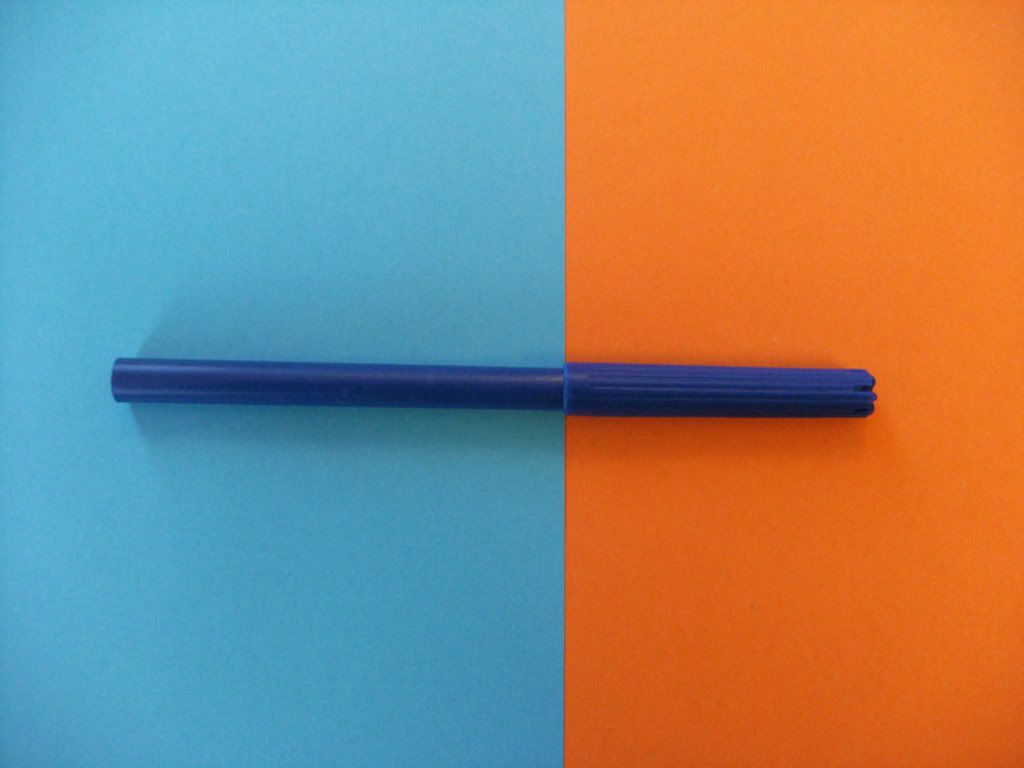
Nice pictures...in a way, i suppose.
But like I say, not really my style!
:) x
I get the concept, that the environment that a colour is viewed in can change what the tone of the colour looks like...even though it doesn't Really, but it looks like it.
BUT...I wouldn't choose to use any of these pictures in my work.
It was...kind of interesting.
But then again, i suppose I lost interest half way through when my battery ran out on my camera lol.
ANYWHO!


Nice pictures...in a way, i suppose.
But like I say, not really my style!
:) x
Subscribe to:
Posts (Atom)
