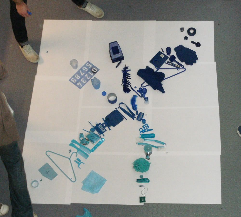
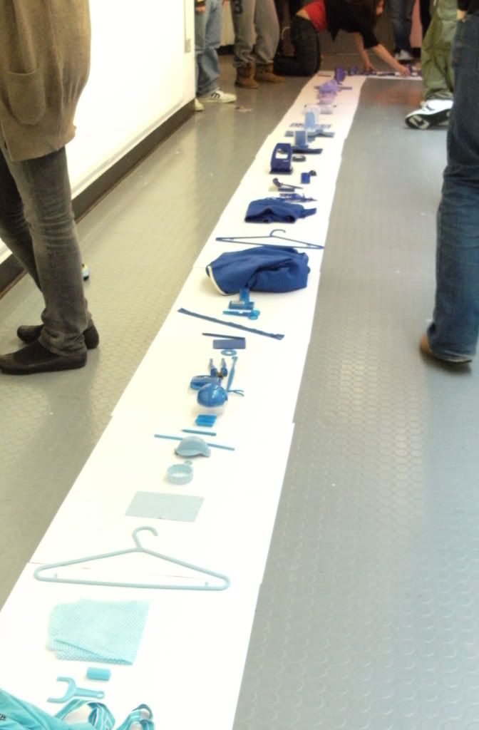
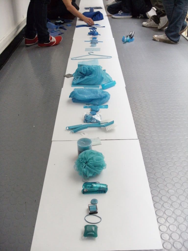
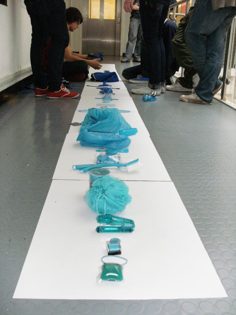
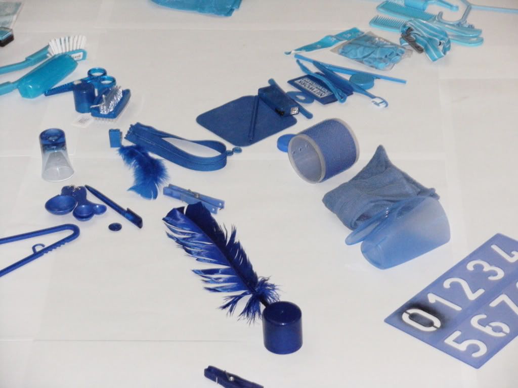
I didn't get this at first BUT after we'd finished, I thought it looked really good.
Then...I made a video.
The quality is SHOCKING :o but the song is intense lol. And I think it works really well with the video. UPDATE: I reloaded the video and it looks better :)
Colour colour colour.
:)
x
Sunday, 16 November 2008
The next 10 posts are gonna be beautiful...
Lol, well! Not really :D Its just to get my work up. So it will be beautiful for me :D haha.
Here goes!
The is old...but nevermind.
Its my alphabet made of shapes - Stars and circles.
I actually liked it, which surprised me! But I would like to do it on illustrator :D So, I will post that soonish!
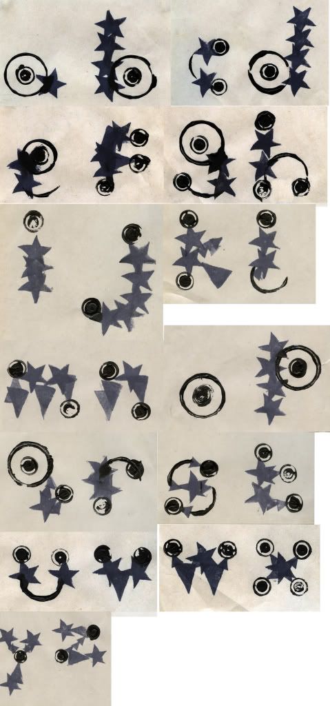
It definately showed me a different way of approaching work, i.e. a quick way of producing something.
:)
x
Here goes!
The is old...but nevermind.
Its my alphabet made of shapes - Stars and circles.
I actually liked it, which surprised me! But I would like to do it on illustrator :D So, I will post that soonish!

It definately showed me a different way of approaching work, i.e. a quick way of producing something.
:)
x
Thursday, 13 November 2008
Visual langauge and Critical studies.
Visual language - I will put some pictures up here of my work.
What do I like most about visual language?
- You see that sometimes, only you understand the message in your work...which to be fair, is pretty important because if you do something really obscure and you think "Yeah, that totally works. I know exactly what it means" and then someone else comes along an goes...."What the hell does that mean?" it makes it pretty pointless :D lol.
Critical studies:
I'm not gonna lie, at the beginning I thought "Oh good lord, this is gonna be the most boring part of my week and probably end up being pointless"
BUT! I have been transformed. My beliefs have been altered, I actually enjoyed reading about subliminal seduction and finding examples of it.
Plus, im glad we actually have a lesson on it and got to watch other peoples presentations, because I would probably never have known about most of those things in detail unless I was there! So there ya go.
Night.x
Sunday, 9 November 2008
Been there, said that.
I have Really really really enjoyed this brief; research and creating the 3 posters.
It has made me realise so many things such as:
- Don't stick to A size papers all the time i.e. 2:1 format, A3 scale is so much nicer to work on than A3!
- Don't need to use black or white all the time i.e. I printed something red onto yellow paper and I liked it so much more than I would of if i'd used black on white.

- Other types of paper i.e. brown packaging paper, can make all the different!
- Photocopying and enlarging type from a newspaper looks intense en mi opinion :)

So - here are my finals, I kind of wanted to print them all on yellow paper but I didn't have enough :) but I do quite like the brown paper. And looking from far away, because of the opacity of the print on yellow paper I may have discovered a problem...My brain looks a bit like a bum?
Which, of course, is not a good thing.
This picture isn't very good, but you get the jist I think.
Night.x
It has made me realise so many things such as:
- Don't stick to A size papers all the time i.e. 2:1 format, A3 scale is so much nicer to work on than A3!
- Don't need to use black or white all the time i.e. I printed something red onto yellow paper and I liked it so much more than I would of if i'd used black on white.

- Other types of paper i.e. brown packaging paper, can make all the different!
- Photocopying and enlarging type from a newspaper looks intense en mi opinion :)

So - here are my finals, I kind of wanted to print them all on yellow paper but I didn't have enough :) but I do quite like the brown paper. And looking from far away, because of the opacity of the print on yellow paper I may have discovered a problem...My brain looks a bit like a bum?
Which, of course, is not a good thing.
This picture isn't very good, but you get the jist I think.

Night.x
I found this Way too hard...
...Therefore, I bet I am thinking too hard and making it more difficult for myself.
I am talking about - Visual Synedoche/Metaphor/Metaphor.
Hmm.
I really didn't know where to start when it came to finding examples.
So, first off I thought of some possible examples, which I have a feeling are wrong, but :-
Visual Synedoche -
- Statue of Liberty (given)
- Big ben
- London eye
- Eiffel tower
- Pyramids
- Sydney opera house
- The Gherkin building
Visual Metaphor -
- Big apple (given)
- Red means stop
- Green means go
- Circle with bit missing and a vertical line down - standby
- 2 equalateral triangles pointing left - rewind
- " " " " right - fast forward
- 1 " traingle pointing right - play
- green phone - answer
- red phone - end call
etc.
Visual metonym -
- Yellow cabs - New york
- Black cabs - london
- Red double decker buses - london
- Casino - Las vegas (possibly? :s )
But finding examples of how graphic artists use them? Now, I am really lost! Therefore here are 2 examples which I thought could show visual literacy -
 Standby, Eject, Mute, Volume up, Volume down, Equals, Plus, Minus, Delete -
Really simple symbols but you know exactly what they mean.
Visual metaphor I think?
 Sony ericsson advert from Shortcut magazine - Black cab, Double decker red bus, bus traffic - London.
I knew/think it is meant to be set in london without it having to say it.
Visual metonym, same as if we see images of yellow cabs we automatically think of new york even though you can get yellow cabs all over - when you see a black cab or red bus you think of london even though you can get them all over england.
I would have liked to have found some examples of visual synedoche, therefore I will keep looking.
And, on that note - I will leave it there.
Night x
I am talking about - Visual Synedoche/Metaphor/Metaphor.
Hmm.
I really didn't know where to start when it came to finding examples.
So, first off I thought of some possible examples, which I have a feeling are wrong, but :-
Visual Synedoche -
- Statue of Liberty (given)
- Big ben
- London eye
- Eiffel tower
- Pyramids
- Sydney opera house
- The Gherkin building
Visual Metaphor -
- Big apple (given)
- Red means stop
- Green means go
- Circle with bit missing and a vertical line down - standby
- 2 equalateral triangles pointing left - rewind
- " " " " right - fast forward
- 1 " traingle pointing right - play
- green phone - answer
- red phone - end call
etc.
Visual metonym -
- Yellow cabs - New york
- Black cabs - london
- Red double decker buses - london
- Casino - Las vegas (possibly? :s )
But finding examples of how graphic artists use them? Now, I am really lost! Therefore here are 2 examples which I thought could show visual literacy -
 Standby, Eject, Mute, Volume up, Volume down, Equals, Plus, Minus, Delete -
Really simple symbols but you know exactly what they mean.
Visual metaphor I think?
 Sony ericsson advert from Shortcut magazine - Black cab, Double decker red bus, bus traffic - London.
I knew/think it is meant to be set in london without it having to say it.
Visual metonym, same as if we see images of yellow cabs we automatically think of new york even though you can get yellow cabs all over - when you see a black cab or red bus you think of london even though you can get them all over england.
I would have liked to have found some examples of visual synedoche, therefore I will keep looking.
And, on that note - I will leave it there.
Night x
Monday, 20 October 2008
Out of the blue...
What is...Blue?
Blue is...Not Edible.
This is my Concept ;)
My initial Idea is:
To illustrate things (foods) that are always a certain colour, i.e. Carrott? and draw it blue.
Simple? But I think it will look good.
Im thinking that I will think of a better media to use after I have initially done this illustration thing.
Seen as its going to be a set, series or sequence I will probably have them all the same BUT I might have the last one as type saying something about Blueberries?
We shall see!
Anyway! I am tired.
Night night, Peace! x
It just flys by!
Time I mean!
I just realised I haven't posted since...2 thursdays ago! Oops :|
SO!...since then. Erm...
Systematic colour - the presentation hurt my eyes lol, and kind of made me nearly fall asleep NOT because it was boring - because it was hurting my eyes, I sat too close to the front.
My typeface based on Ross Stanton - I panicked at the last minute to get something done and although I was kind of happy with the outcome, I dont think it really think it was the best it could have been, so i'll be continuing with that!
This is the final one:
I wish I had pursued this idea a bit more, even though I did loads from it, but just gave up for no reason:
And this is Ross' typeface based on me:
Yepp, thats just a plain wall. I don't know what it looks like because he wasn't there. Grr :D
Anyway! Moving on!
Illustrator - I like illustrator, but I've only every really known how to do the really basic things on it so i'm quite looking forward to these workshops! Although...I knew everything from the first one, haha.
Print - Screen printing - I SO want to do more of this. I did it last year and just thought "Whats the point? It takes So long to produce the screen...you might aswell do it on a computer"
But it looks so much better screen printed, and it feels a hell of a lot more satifying to know you've done it all!!
(Insert more bloody images. Stupid blogger!! Grr)
And FINALLY! Today...actually, i'll do this on another post lol.
Peace Out x
I just realised I haven't posted since...2 thursdays ago! Oops :|
SO!...since then. Erm...
Systematic colour - the presentation hurt my eyes lol, and kind of made me nearly fall asleep NOT because it was boring - because it was hurting my eyes, I sat too close to the front.
My typeface based on Ross Stanton - I panicked at the last minute to get something done and although I was kind of happy with the outcome, I dont think it really think it was the best it could have been, so i'll be continuing with that!
This is the final one:

I wish I had pursued this idea a bit more, even though I did loads from it, but just gave up for no reason:

And this is Ross' typeface based on me:

Yepp, thats just a plain wall. I don't know what it looks like because he wasn't there. Grr :D
Anyway! Moving on!
Illustrator - I like illustrator, but I've only every really known how to do the really basic things on it so i'm quite looking forward to these workshops! Although...I knew everything from the first one, haha.
Print - Screen printing - I SO want to do more of this. I did it last year and just thought "Whats the point? It takes So long to produce the screen...you might aswell do it on a computer"
But it looks so much better screen printed, and it feels a hell of a lot more satifying to know you've done it all!!
(Insert more bloody images. Stupid blogger!! Grr)
And FINALLY! Today...actually, i'll do this on another post lol.
Peace Out x
Thursday, 9 October 2008
Epilog? Apelogy? What...
Oooh...Apeloig ;)
 Considering the work I have done today (Which I will put up...) and the crit I had, I think this is quite appropriate to record. I can't say it was an inspiration because I found it after I had done my work, but the process of layering two typefaces to create a new one is what I am currently exploring.
 I thought I would just put this one up because it is So simple and only uses a few shapes, yet it looks like a well established and successful typeface. Good stuff!
Goodnight sweetArt.x
 Considering the work I have done today (Which I will put up...) and the crit I had, I think this is quite appropriate to record. I can't say it was an inspiration because I found it after I had done my work, but the process of layering two typefaces to create a new one is what I am currently exploring.
 I thought I would just put this one up because it is So simple and only uses a few shapes, yet it looks like a well established and successful typeface. Good stuff!
Goodnight sweetArt.x
Lets dance to joy division...
The Luxury of Protest.
 Considering that it just looks like a shape from far away...
The work that has gone into it when you look closely is Crazy good lol.


 "Using information design principles and graphical techniques, the 85+ recorded covers of Joy Division's "Love Will Tear Us Apart" is mapped in relation to the original recordings by the band."
Awesome.x
 Considering that it just looks like a shape from far away...
The work that has gone into it when you look closely is Crazy good lol.


 "Using information design principles and graphical techniques, the 85+ recorded covers of Joy Division's "Love Will Tear Us Apart" is mapped in relation to the original recordings by the band."
Awesome.x
Its like being a child again...
Subscribe to:
Posts (Atom)

