Sunday, 31 May 2009

Mr. Motivator...

Motivational Mascot...
Is there anyone better? :o

Mr Motivator!

Traced...Scanned...Illustrated...
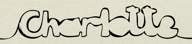
x

Changggge

Well. Even though I loved my first logo, I figured that the type I used didn't really work with the theme of the rest of my project...so I changed it to a more 'rough', hand-drawn looking type.
x

Time!

Moved on a lot at this point...
I felt I needed to tackle the issue of branding. Although its not exactly a campaign or anything that I am doing, I need there to be some sort of logo so that you can identify that all that the things in my pack go together.

After many sketchs and scans etc. I came up with this...

...which I am very happy with.
I then thought it would look good all cut out/like a stencil.
Although I am really happy with the outcome of this...
I don't actually know what I can do with this? I love it but, with the amount of time that it took...it may prove to be pointless, which is annoying.
x

First proposal boards

For the first crit of the brief I put together 2 proposal boards because I felt it was the most successful way of saying what I wanted.


Self explanatory really...
x

Tuesday, 12 May 2009

Change of Plan...

Sooo...

My original plan was 'to motivate students to get more involved in group work', But I had a change of plan mainly based on last weeks crit because someone said they weren't sure what the problem was...(Even though on one of my boards, in capital letters, bright red writing, about 48 pt size...it said what I aimed to do etc...lol.)

Anywhooooo, I thought that gave me a chance to re-direct my project slightly, to "Encourage students to motivate themselves to do work outside college"...i.e. carry on doing college work at home.

I Guess it is based around time management...but I didn't want to write that because I hate the phrase.

So! Off we go, fun fun fun.
x

Friday, 1 May 2009

Yes.

What did I used to be?

When I started the course I was pretty confident that I would just use photographs in pretty much everything I did and that I could never be good at illustration. I always thought that if I tried do illustration, it would make my work look bad because everyone was better than me at it. One thing I believed was that, I would get onto the course and everyone would already have their 'style'...while I didn't really have a clue, but i still didn't like experimenting out of my comfort zone. On a positive, I thought I was good(ish) on photoshop and illustrator, and this still stands true...I know enough to get me by; And, I've always loved words so I liked typography...

Where am I Now? 

I have become more confident with my own work, where I used to think everyone elses work was better than mine, even if I didn't really like theirs...I now know, everyone is good at different things, and likes different things. Its not a bad thing. Also, the fact I Knew I didn't have a style has benefit me because I have become more willing to work out of my comfort zone and I think this is what is making me like my work more. I still really like typography, but I am starting to enjoy illustration more because it doesn't all have to be the same style as everyone elses. So...I still don't know what I like best. One more thing is that I've learnt how much research can help, i've definately got better at this!

Where do I Intend to be?

- I want to experiment and become more confident with illustration.
- Become more aware of contemporary graphic design - more research into this.
- I want to generate more ideas or get better at generating ideas.

x

Thursday, 30 April 2009

Cinco...

So...for our PPD session, we have been asked to find 5 examples of Graphic design that may influence our Speaking from experience brief.
Due to the fact I'm not set on one idea of what I want to do yet, I tried to find kind of diverse examples but all sticking around the idea of illustration as type...

Shaz Madani
I used this the last type that we needed 5 example of type...riiiiight near the beginning of the year. But I still like it, so why not use it again. I love crafty things and I Really like 3D lettering BUT having the 3D letters and photographing them.
Julien Vallee
Once again...my love of crafty things influences my choice for this one. The colour and style f type etc. are well suited to the audience - it was for mtv one, so its not exactly aimed at grandparents.
Matterbox
I chose this because I like the idea of using something like it to communicate with the audience. I like the simplicity of the packaging...maybe not the pale blue, but the crafting of it.

Mike Perry
I did have some examples from Hand Job...but then I forgot to bring my book and scan, but it was pretty similar to this just good examples of illustrative type.
Mr Bingo
At the moment I'm going through of phase of loving this stuff. But for this, its just another example of the style of illustration I would like to work with.
And...I can't believe that just by drawing hair I know who his "hair portraits" are of. Love it.

x

Tuesday, 28 April 2009

Speaking from experience...

So, after I looked at the first 5 problems that I started with...I decided they were a little bit boring and stuff. I just didn't really think any of them could keep me interested. Soo, I started again. I started thinking about the things that bothered me throughout the course...

What Problem?: I identified my problem as; not wanting to work with people i'm not friends with/people I don't necessarily know. This was definately something that bothered more at the beginning of the year than it does now.

What am I going to do about it?: In my work I aim to somewhat advise the audience or 'inform' them that its not as bad as you first think.

How will I do?: I want to work primarily with type, but not type like helvetica etc. more in terms of illustration as type because I think that would be more appropriate to the audience and it will just make it more interesting in general. I'm not 100% sure how I want it to be presented, I just know that...I don't really want to do a poster.

Lets go!
x


I can't believe how long I haven't posted for? wow.

Wednesday, 1 April 2009

The End...

What is a line was handed in today...

Here are my final(?) resolutions,
I didn't know whether to say my animation or my patterns were my final resultions.

Animation:


Colour in Wallpaper/Wrapping paper :o
I coloured one of these in after I printed it and loved it :D I would love to have colour in wallpaper!
I could hve done so many different combinations, but lack of time etc. didn't help.

BUT Because I like them, I might do some for myself.

Below: I was simply experimenting with backgrounds, I think the polka dot one works quite well with the girly feel.


I need to sleep.x

Monday, 23 March 2009

Hmm.

Well! I've got...100 photos of 100 things in my bedroom. 100 continuous line drawings of 100 things in my bedroom AND 100 scans of 100 continuous line drawings of 100 things in my bedroom :) Did you get all that? Lol.

Below is a really quick mock of a conveyor belt idea I was thinking of? I quite like the effect it has, but I need to make the images look a bit better? Possibly vectorise them. If not - then I need to make sure the line at the bottom connects on all of them.


In addition to this, I was toying with the idea of a border for a bedroom?
More specifically, a childrens bedroom, like a 'colour in border'.

Lovely jubbly.
Im happy.
x