More to do with the brief and my approach to it I think:

 I think this typeface works really well for the particular word because it actually looks like the letters are all wrapped together. The weighting of the type and line quality are definitely a positive factor in this typeface!
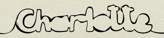
 This is just a REALLY good example of how useful it is to base your typeface upon an existing one, and although it is clearly based on a typical sans serif typeface (step.2) it looks completely different in the end.
 I thought this was quite appropriate to my work because i've actually decided to take colour into account and how it can effect something.
Sweeeet.x

1 comment:
i agree, the 'wrap' typeface is very cool.
Post a Comment